
Project: Serenade responsive website
Role: Lead UX Designer
Project Overview

The Product: Serenade is a musician booking website for the up and coming wedding venue, City Winery. City Winery wanted a product that their clients could use to book talent for their wedding events in once centralized place.

Duration: January - February 2023

My Role: Lead UX Designer. Designer designing the apps, Serenade, booking process.

The Goal: Design a desktop version of the sister app for City Winery that allows users to book a musician for their wedding, easily, securely, and efficiently.

Responsibilities: Conducting interviews, paper and digital wireframing, low and high-fidelity prototyping, conducting usability studies, accounting for accessibility, and integrating on designs.
Challenges
1) Create an interface that allows easy and efficient booking process.
2) Incorporate a way for the user to access as much info on a musician on one page without text overwhelm.
3) Construct a tool that allows users to filter their search.

The Problem: Busy clients or event planners need an easier and more efficient way to book a musician without the hassle.
Understanding the user
-
User research
-
Personas
-
Problem statements
-
User journey maps
User Research Summary

I conducted interviews and created empathy maps to understand the user’s I’m designing for and their needs. A primary user group identified through research was working adults from various backgrounds who are responsible for the majority of their wedding planning.
The user group confirmed the initial assumptions about Serenade’s potential users, but research also revealed that accessibility to the user’s specific wants and needs makes reaching their goal very difficult. Other user problems included, poor scheduling software within booking apps and difficult booking processes.
Pain Points
1
Scheduling
The calendars not syncing up to musicians availability, causing scheduling issues.
2
Variety
Should be broader selection to fit people from many different backgrounds, races, cultures, etc.
3
IA
Text heavy screens can be overwhelming and time consuming to get through.
4
Financial
Price or rates should be displayed earlier in the process to save user some time of looking into a musician who is out of their budget.
Meet the Users

PRIMARY
Name: Elliot
Age: 31
Family: Engaged, no children
Occupation: Culinary Chef

SECONDARY
Name: Leah
Age: 53
Family: Single
Occupation: Wedding/Event Planner
Elliot and his fiancé, Ben, are getting married in late 2023. They found the perfect venue and are now on the hunt for a musician to perform on their special day. It is crucial that the musician is an LGBTQ+ ally, has credibility, and is, of course, available on their wedding date. Elliot values clear and prompt communication with the musician and wants an app that allows him to communicate directly with the musician to discuss any specific needs or requests.
Leah is a well established wedding planner in her area specializing in weddings and events. She is extremely busy and often has multiple events to plan at once. She needs a booking app that's easy to use and saves her time. Leah also values reliability and professionalism in musicians. She needs to be able to trust that the musicians she books will show up on time and perform well.
Starting the design
-
Paper wireframes
-
Digital wireframes
-
Low-fidelity prototype
-
Usability studies
Paper Wireframes
I sketched out some paper wireframes for each key screen of the website, keeping the user pain points about navigation, browsing, and booking flow in mind.


Paper wireframe
screen size variation(s)
Because Serenade’s users access the site on a variety of different devices, i started to work on designs for additional screen sizes to make sure the site would be fully responsive.
Digital Wireframes
Moving from paper to digital wireframes made it easy to understand how the redesign could help address user pain points and improve the user experience.
Prioritizing useful button locations and strong visual element placement on the homepage was a key part of my strategy.
Easy access to talent
Homepage is optimized for easy browsing through list of categories (popular categories) and navigation menu items.

Digital wireframe screen size variation(s)

Lo-fi Prototype
To create a low-fidelity prototype, I connected all the screens involved in the primary user flow of booking a musician.
At this point, I had received feedback on my designs from members of my team about things like placement of buttons and page organization. I made sure to listen to their feedback, and I implemented several suggestions in places that addressed user pain points.

Usability study: parameters

Study type:
Unmoderated usability study
.png)
Participants:
5 participants
.png)
Location:
United States, remote
.png)
Length:
25-30 minutes
Usability Study Findings
These were the main findings uncovered by the usability study:
1
2
3
Navigation
Primary CTA wasn’t obvious from homepage.
Booking Process
Once a musician was selected, user was unsure if they were available for their specific date.
Browse
While browsing talent options, there was no way fo them to filter out specific musicians.
Refining the design
-
Mockups
-
High-fidelity prototype
-
Accessibility
Mockups
Based on the insights from the usability study, I made changes to improve the site’s browsing flow. One of the changes I made was adding the option to filter the selection of musicians to fit the users desires. This allowed users more freedom to browse and compare different musicians.
Before usability study
After usability study


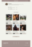
To make the browsing process better for the user, I added a carousel that highlights “Top Talent” that they can click on and be directed straight to the talent profiles.
Before usability study
After usability study

Mockups: original screen size


Mockups: screen size variations
I included considerations for additional screen sizes in my mockups based on my earlier wireframes. Because users browse from a variety of devices, I felt it was important to optimize the browsing experience for a range of device sizes, such as mobile so users can have the smoothest experience possible.


Hi-fi Prototype
My hi-fi prototype followed the same user flow as the lo-fi prototype, and included the design changes made after the usability study, as well as several changes suggested by my peers.

Accessibility considerations
I designed the site with alt text available on each page for smooth screen reader access.
1
2
I used headings with different sized text for clear visual hierarchy.
Takeaways
-
Impact
-
What I learned

Impact:
Our target users shared that the design was intuitive to navigate through, more visually engaging with the images, and demonstrated a clear visual hierarchy.

What I learned:
I learned that even the smallest changes in a design can have a big impact on the user experience. The most important takeaway for me is to focus on real user needs when coming up with design ideas and solutions.
Thank you for taking the time to review my work! To see more, click here. Other ways to connect, check out my socials down below.